Data Exploration SES - 2014
Joffrey JOUMAA
August 22, 2023
Source:vignettes/data_exploration_ses_2014.Rmd
data_exploration_ses_2014.RmdThis document aims at exploring the dataset of 9 southern-individuals
in 2014. For that purpose, we need first to load the
ontodive package to load data.
Let’s have a look at what’s inside
data_ses$data_2014:
# list structure
str(data_ses$year_2014, max.level = 1, give.attr = F, no.list = T)
## $ ind_140059:Classes 'data.table' and 'data.frame': 2305 obs. of 29 variables:
## $ ind_140060:Classes 'data.table' and 'data.frame': 1866 obs. of 29 variables:
## $ ind_140062:Classes 'data.table' and 'data.frame': 2619 obs. of 29 variables:
## $ ind_140063:Classes 'data.table' and 'data.frame': 1570 obs. of 29 variables:
## $ ind_140068:Classes 'data.table' and 'data.frame': 1904 obs. of 29 variables:
## $ ind_140069:Classes 'data.table' and 'data.frame': 2123 obs. of 29 variables:
## $ ind_140072:Classes 'data.table' and 'data.frame': 2625 obs. of 29 variables:
## $ ind_140073:Classes 'data.table' and 'data.frame': 1692 obs. of 29 variables:
## $ ind_140075:Classes 'data.table' and 'data.frame': 1451 obs. of 29 variables:A list of 9
data.frames, one for each seal
For convenience, we aggregate all 9 individuals into one dataset.
# combine all individuals
data_2014 <- rbindlist(data_ses$year_2014)

# display
DT::datatable(data_2014[sample.int(.N, 10), ], options = list(scrollX = T))Summary
# raw_data
data_2014[, .(
  nb_days_recorded = uniqueN(as.Date(date)),
  nb_dives = .N,
  maxdepth_mean = mean(maxdepth),
  dduration_mean = mean(dduration),
  botttime_mean = mean(botttime),
  pdi_mean = mean(pdi, na.rm = T)
), by = .id] %>%
  sable(
    caption = "Summary diving information relative to each 2018 individual",
    digits = 2
)| .id | nb_days_recorded | nb_dives | maxdepth_mean | dduration_mean | botttime_mean | pdi_mean |
|---|---|---|---|---|---|---|
| ind_140059 | 238 | 2305 | 216.36 | 750.18 | 394.32 | 8218.73 |
| ind_140060 | 189 | 1866 | 188.91 | 580.63 | 269.35 | 7903.56 |
| ind_140062 | 264 | 2619 | 148.45 | 561.22 | 296.67 | 8643.92 |
| ind_140063 | 159 | 1570 | 175.05 | 614.46 | 307.30 | 7779.18 |
| ind_140068 | 192 | 1904 | 165.77 | 663.89 | 336.68 | 7950.71 |
| ind_140069 | 212 | 2123 | 174.01 | 549.01 | 259.39 | 8052.52 |
| ind_140072 | 264 | 2625 | 173.33 | 571.55 | 244.76 | 7928.25 |
| ind_140073 | 176 | 1692 | 190.48 | 617.03 | 276.21 | 7850.67 |
| ind_140075 | 141 | 1451 | 132.48 | 465.18 | 194.11 | 7837.99 |
Some explanatory plots
Missing values
# build dataset to check for missing values
dataPlot <- melt(data_2014[, .(.id, is.na(.SD)), .SDcol = -c(
  ".id",
  "divenumber",
  "divetype",
  "date"
)])
# add the id of rows
dataPlot[, id_row := c(1:.N), by = c("variable", ".id")]

# plot
ggplot(dataPlot, aes(x = variable, y = id_row, fill = value)) +
  geom_tile() +
  labs(x = "Attributes", y = "Rows") +
  scale_fill_manual(
    values = c("white", "black"),
    labels = c("Real", "Missing")
  ) +
  facet_wrap(.id ~ ., scales = "free_y") +
  theme_jjo() +
  theme(
    legend.position = "top",
    axis.text.x = element_text(angle = 45, hjust = 1),
    legend.key = element_rect(colour = "black")
  )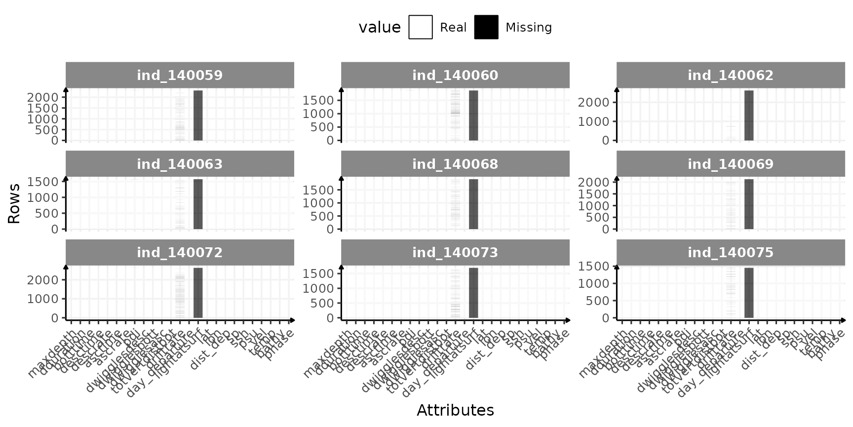
Check for missing value in 2018-individuals
Let’s look closer to the variables with missing values:
# table with percent
table_inter <- data_2014[, lapply(.SD, function(x) {
  round(length(x[is.na(x)]) * 100 / length(x), 1)
}), .SDcol = -c(
  ".id",
  "divenumber",
  "divetype",
  "date"
)]

# find which are different from 0
cond_inter <- sapply(table_inter, function(x) {
  x == 0
})

# display the percentages that are over 0
table_inter[, which(cond_inter) := NULL] %>%
  sable(caption = "Percentage of missing values per columns having missing values!") %>%
scroll_box(width = "100%")| driftrate | lightatsurf |
|---|---|
| 4.7 | 100 |
Nothing bad, missing values seem to occur only in column we are not interested in.
Outliers
Let’s see if we have some outliers. Some of them are quiet easy to spot looking at the distribution of dive duration:
# plot
ggplot(
  melt(data_2014,
    id.vars = c(".id"),
    measure.vars = c("dduration", "maxdepth", "driftrate")
  ),
  aes(x = value, fill = .id)
) +
  geom_histogram(show.legend = FALSE) +
  scale_x_continuous(n.breaks = 3) +
  facet_grid2(variable ~ .id,
    scales = "free",
    independent = "x",
    labeller = labeller(.id = function(x) {
      sub(
        "ind_",
        "",
        unique(x)
      )
    })
  ) +
  labs(y = "# of dives") +
  theme_jjo()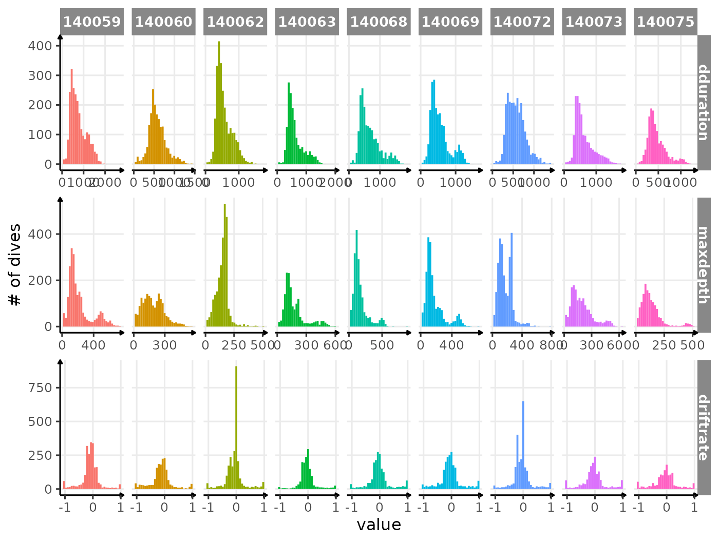
Distribution of dduration, maxdepth and
driftrate for each seal
Nothing that obvious, which is great :)
All Variables
names_display <- names(data_2014[, -c(
  ".id",
  "date",
  "divenumber",
  "lightatsurf",
  "divetype",
  "day_departure",
  "phase",
  "lat",
  "lon",
  "sp"
)])

# calulate the median of driftrate for each day
median_driftrate <- data_2014[divetype == "2: drift",
  .(driftrate = quantile(driftrate, 0.5)),
  by = .(date = as.Date(date), .id)
]

# let's identity when the smooth changes sign
changes_driftrate <- median_driftrate %>%
  .[, .(
    y_smooth = predict(loess(driftrate ~ as.numeric(date), span = 0.25)),
    date
  ), by = .id] %>%
  .[c(FALSE, diff(sign(y_smooth)) != 0), ]
Full trip duration
for (i in names_display) {
  cat("#####", i, "{.unlisted .unnumbered} \n")
  if (i == "driftrate") {
    print(
      ggplot(
        data = melt(data_2014[, .(.id, date, get(i), divetype)],
          id.vars = c(".id", "date", "divetype")
        ),
        aes(
          x = as.Date(date),
          y = value,
          col = divetype
        )
      ) +
        geom_point(
          alpha = 1 / 10,
          size = .5
        ) +
        geom_vline(
          data = changes_driftrate,
          aes(xintercept = date),
          linetype = 2
        ) +
        facet_wrap(. ~ .id, scales = "free") +
        scale_x_date(date_labels = "%m/%Y") +
        labs(x = "Date", y = "Drift Rate m/s", col = "Dive Type") +
        theme_jjo() +
        theme(
          axis.text.x = element_text(angle = 45, hjust = 1),
          legend.position = "bottom"
        ) +
        guides(colour = guide_legend(override.aes = list(
          size = 7,
          alpha = 1
        )))
    )
  } else {
    print(
      ggplot(
        data = melt(data_2014[, .(.id, date, get(i))],
          id.vars = c(".id", "date")
        ),
        aes(
          x = as.Date(date),
          y = value,
          col = .id
        )
      ) +
        geom_point(
          show.legend = FALSE,
          alpha = 1 / 10,
          size = .5
        ) +
        geom_vline(
          data = changes_driftrate,
          aes(xintercept = date),
          linetype = 2
        ) +
        facet_wrap(. ~ .id, scales = "free") +
        scale_x_date(date_labels = "%m/%Y") +
        labs(x = "Date", y = i) +
        theme_jjo() +
        theme(axis.text.x = element_text(angle = 45, hjust = 1))
    )
  }

  cat("\n \n")
}
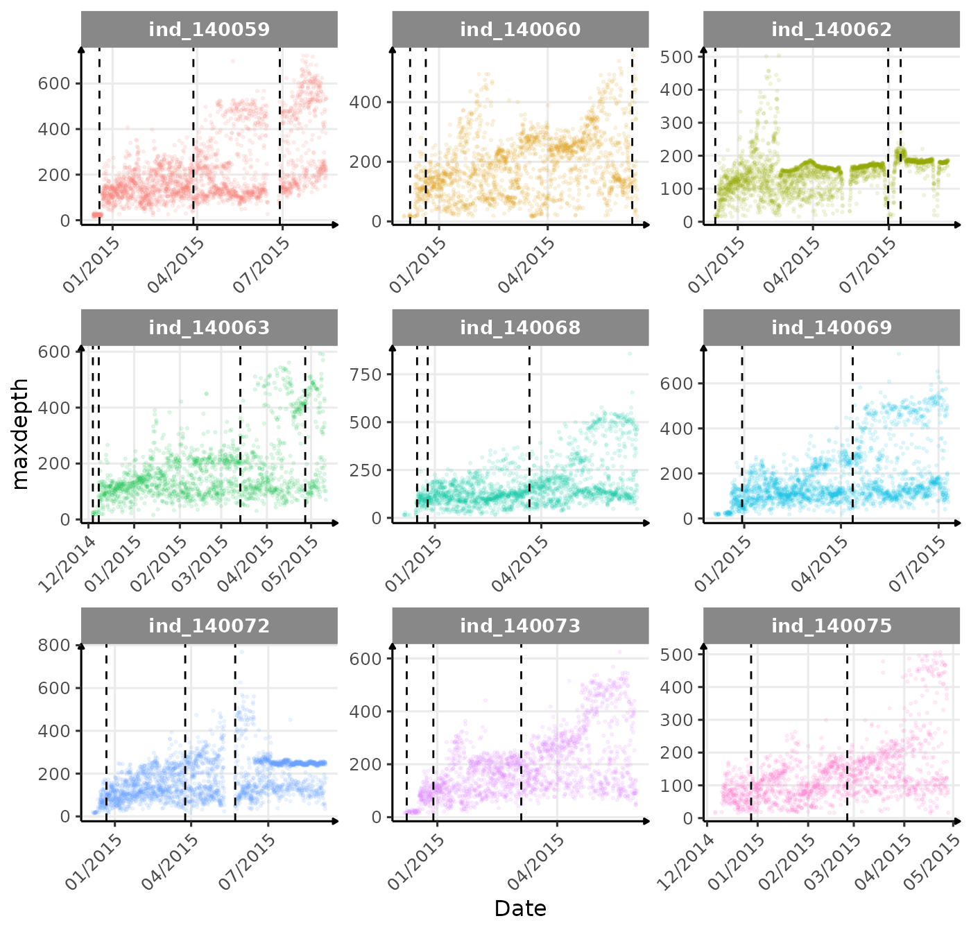
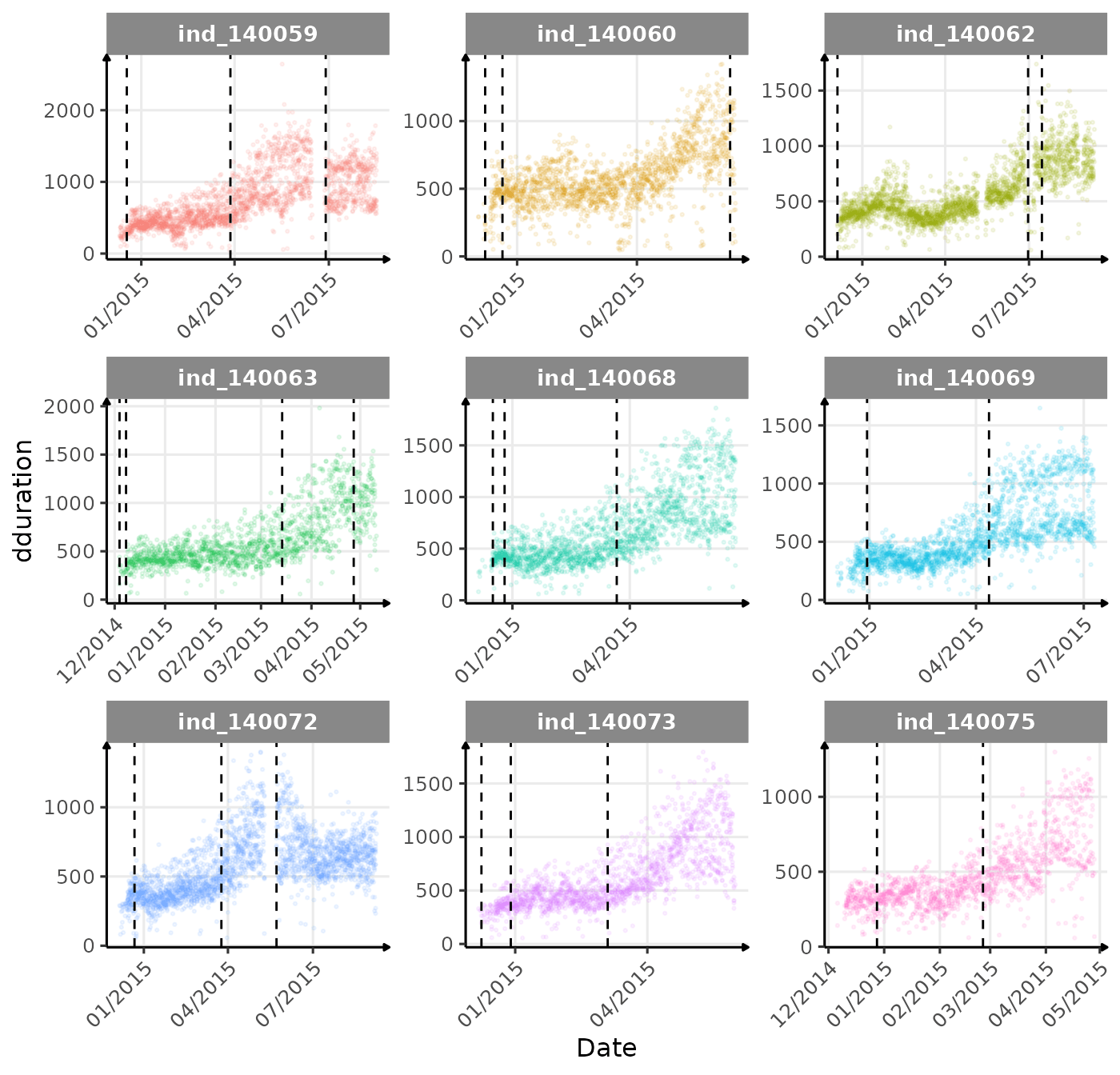
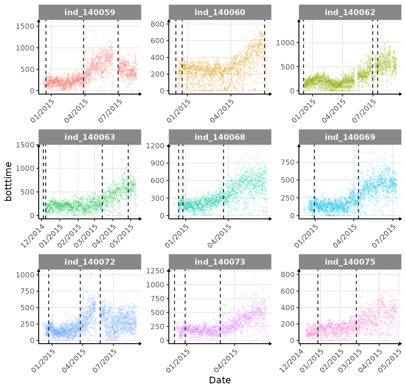
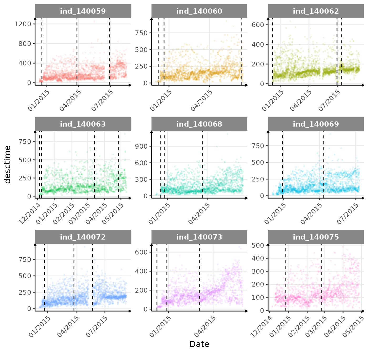
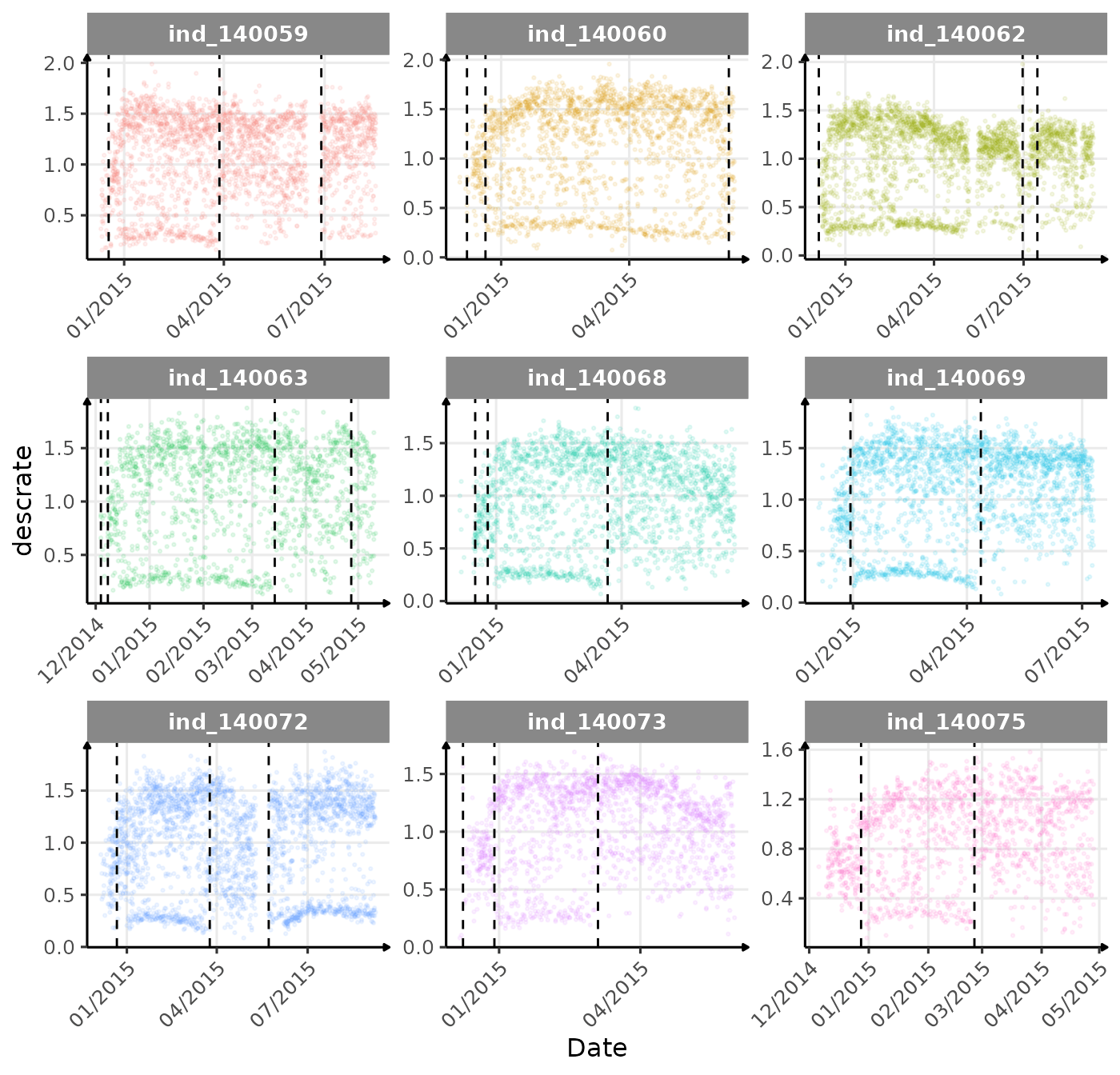
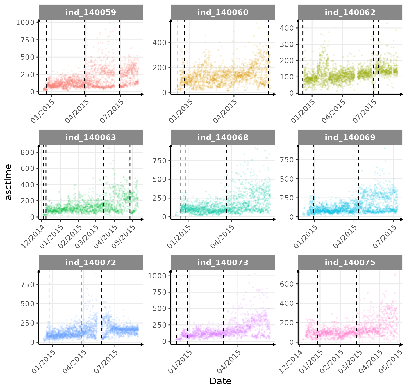
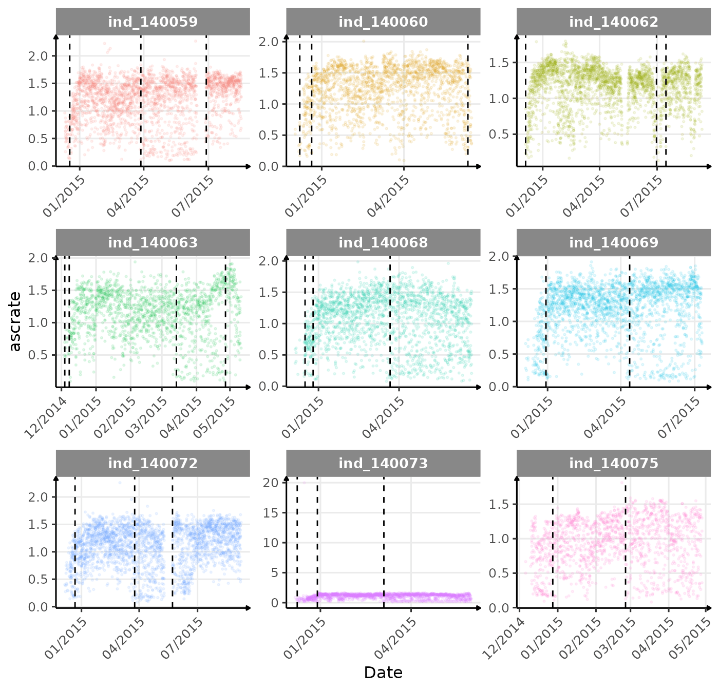
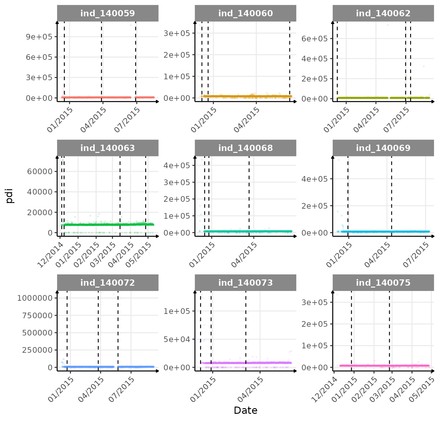
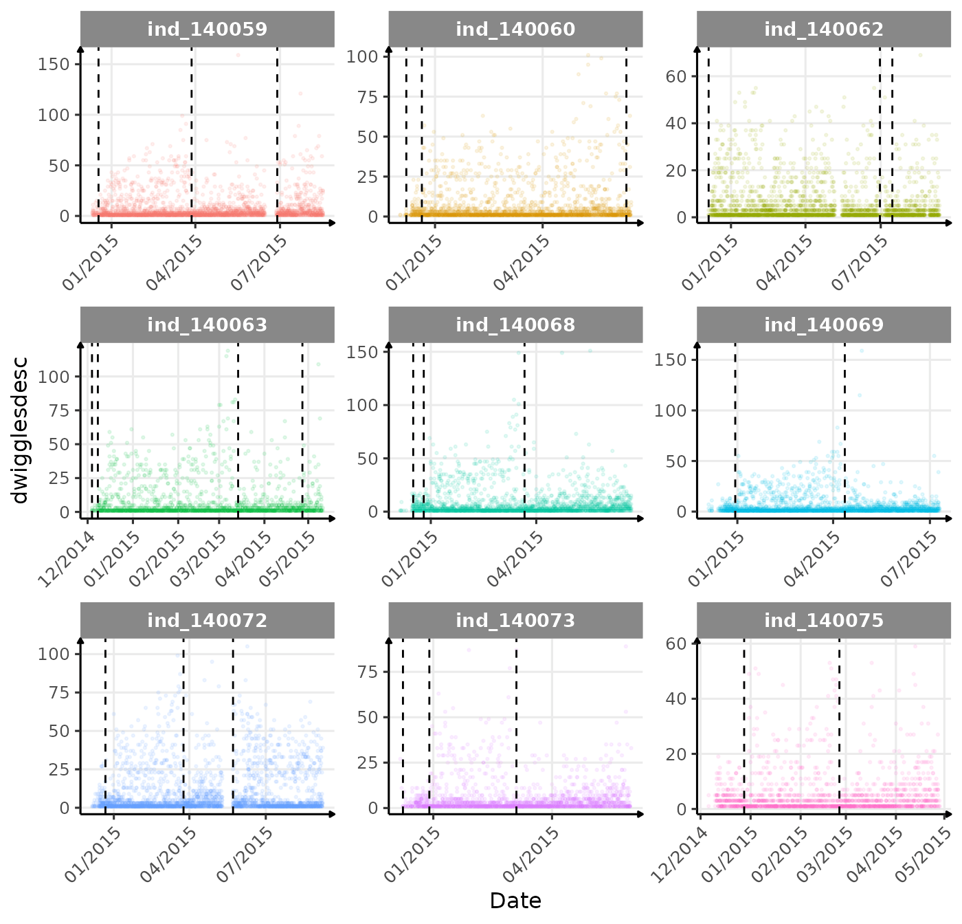
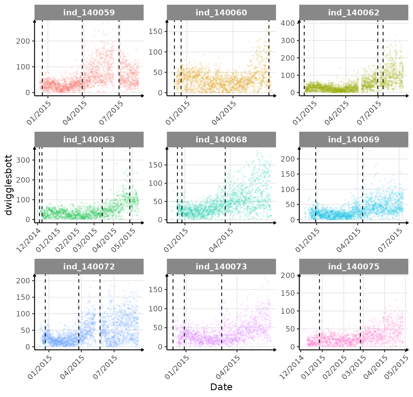
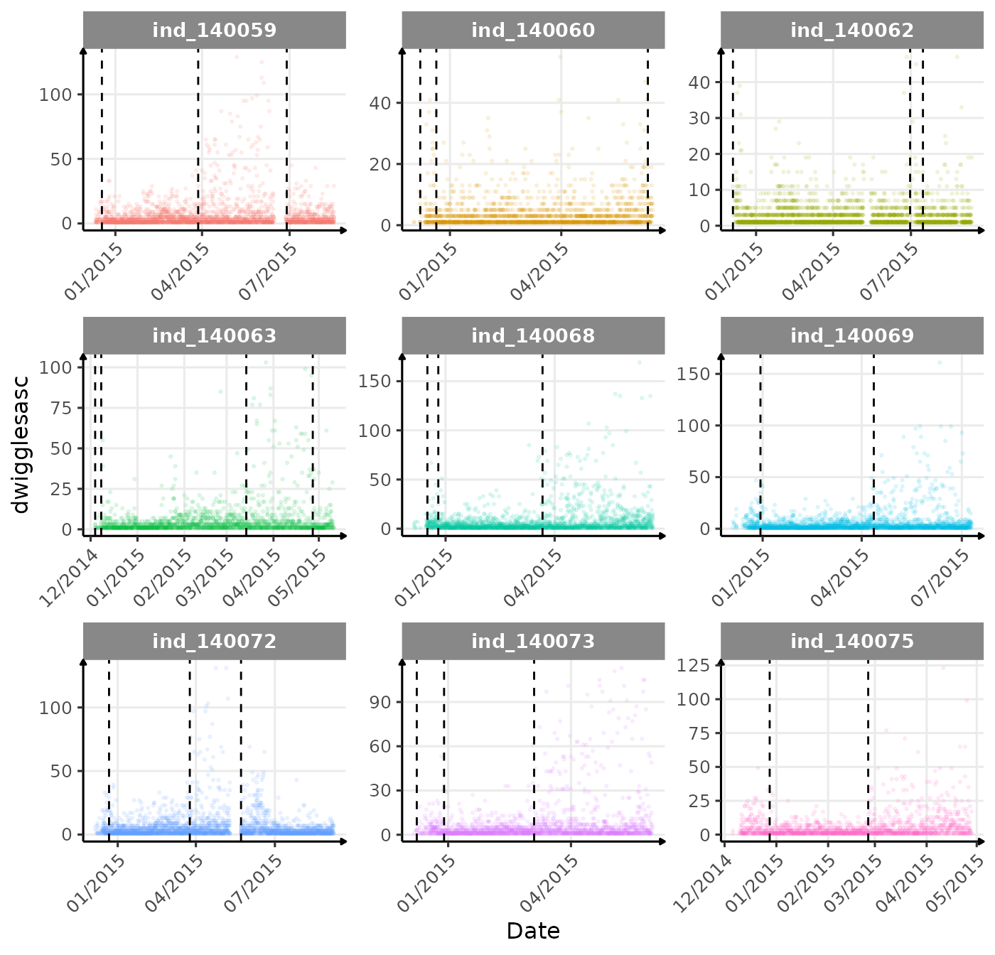
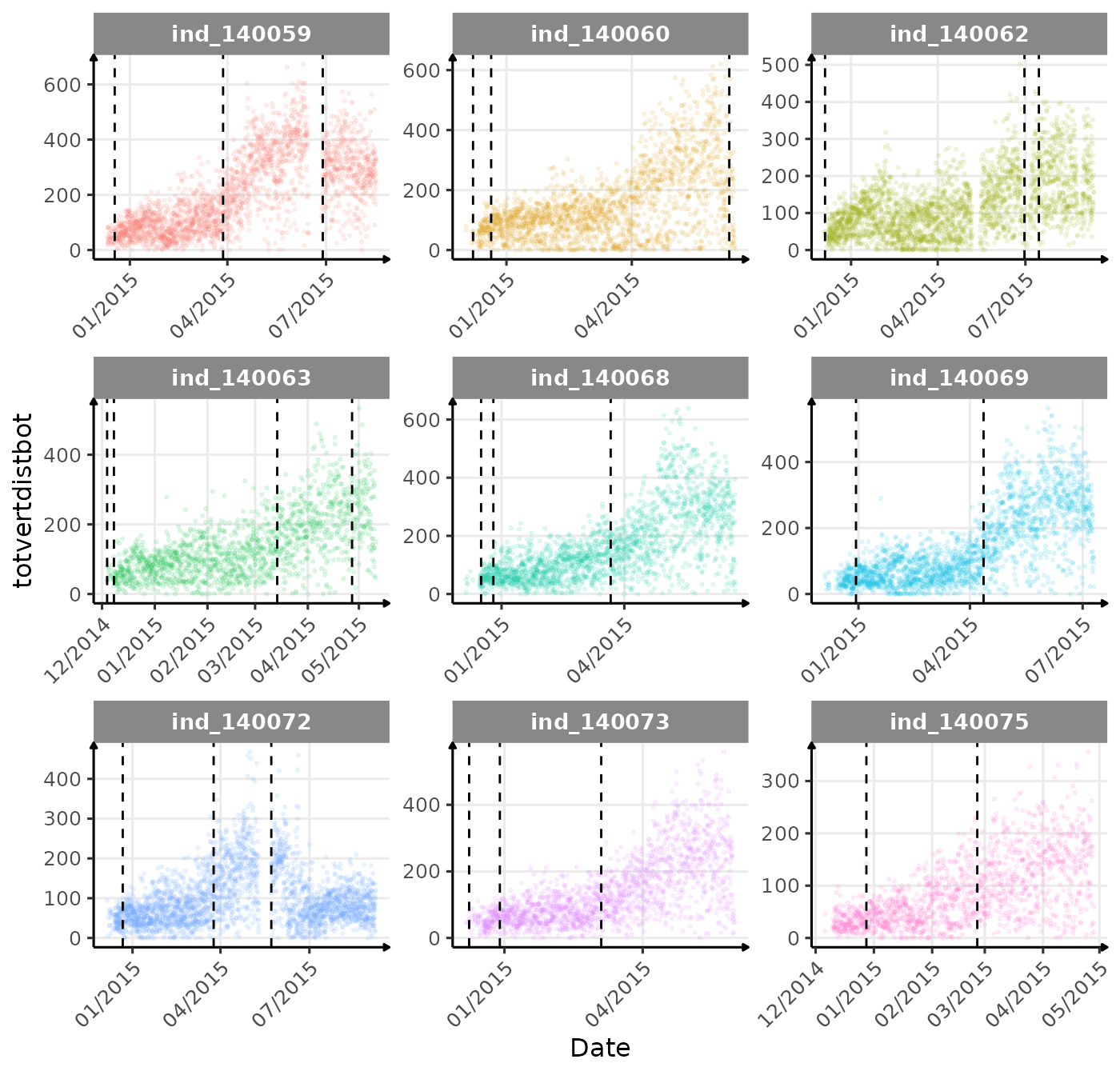
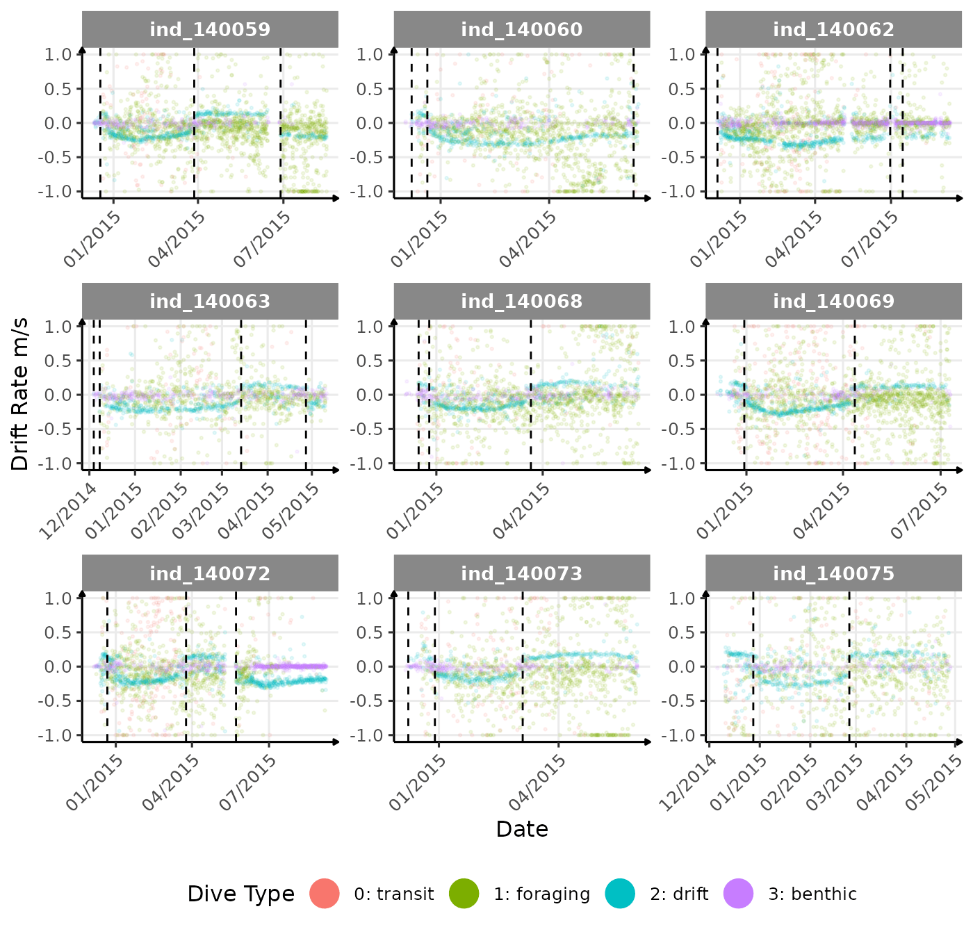
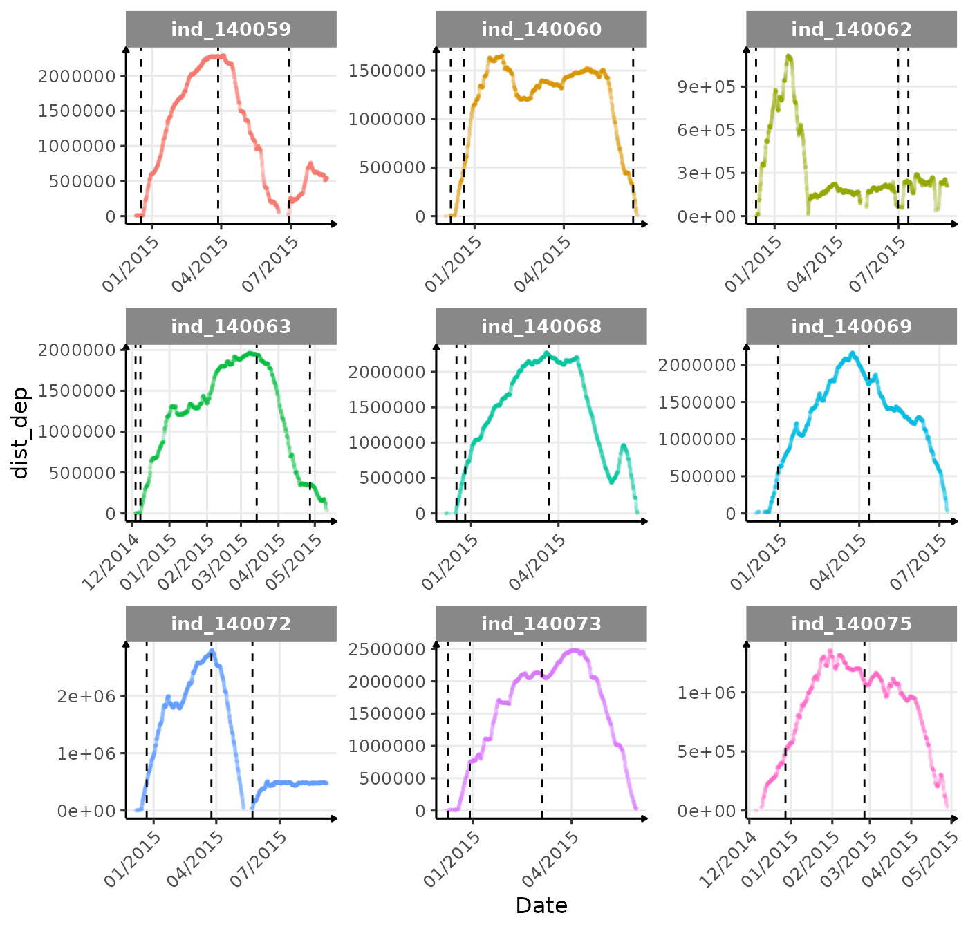
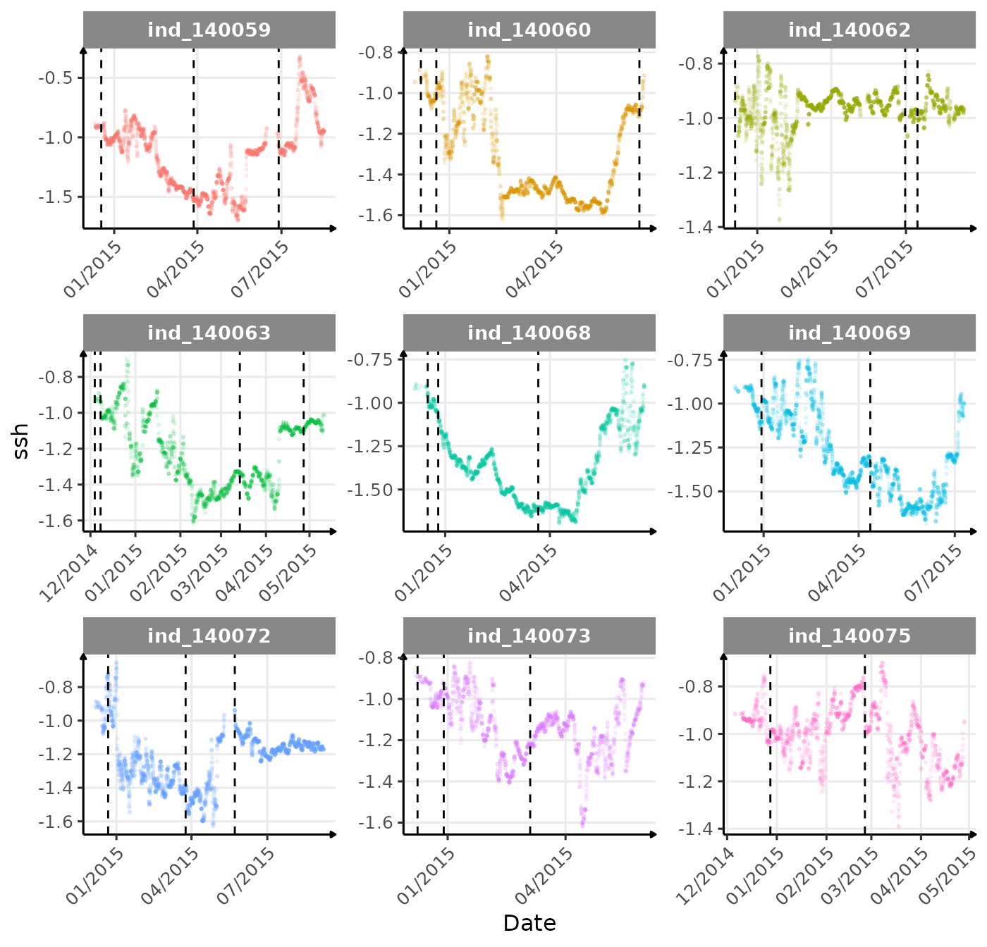
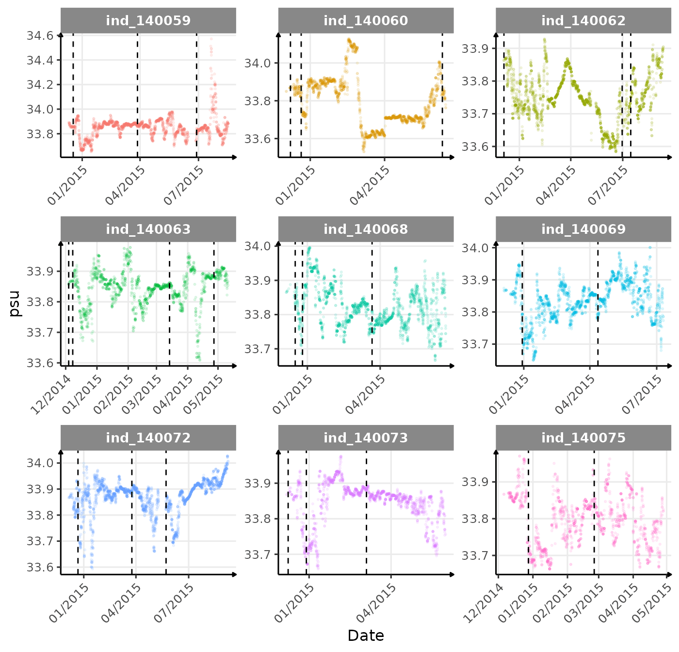
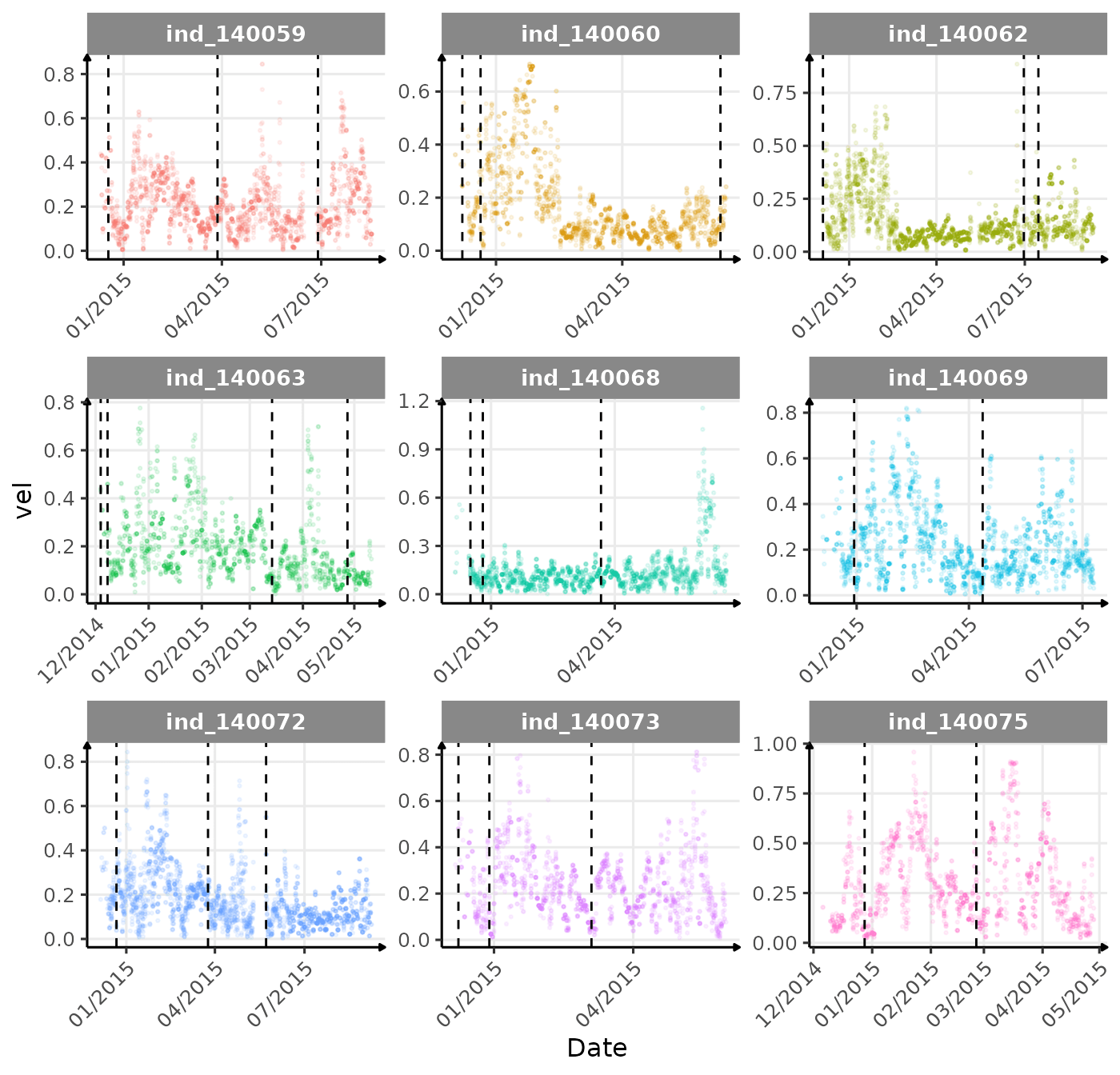
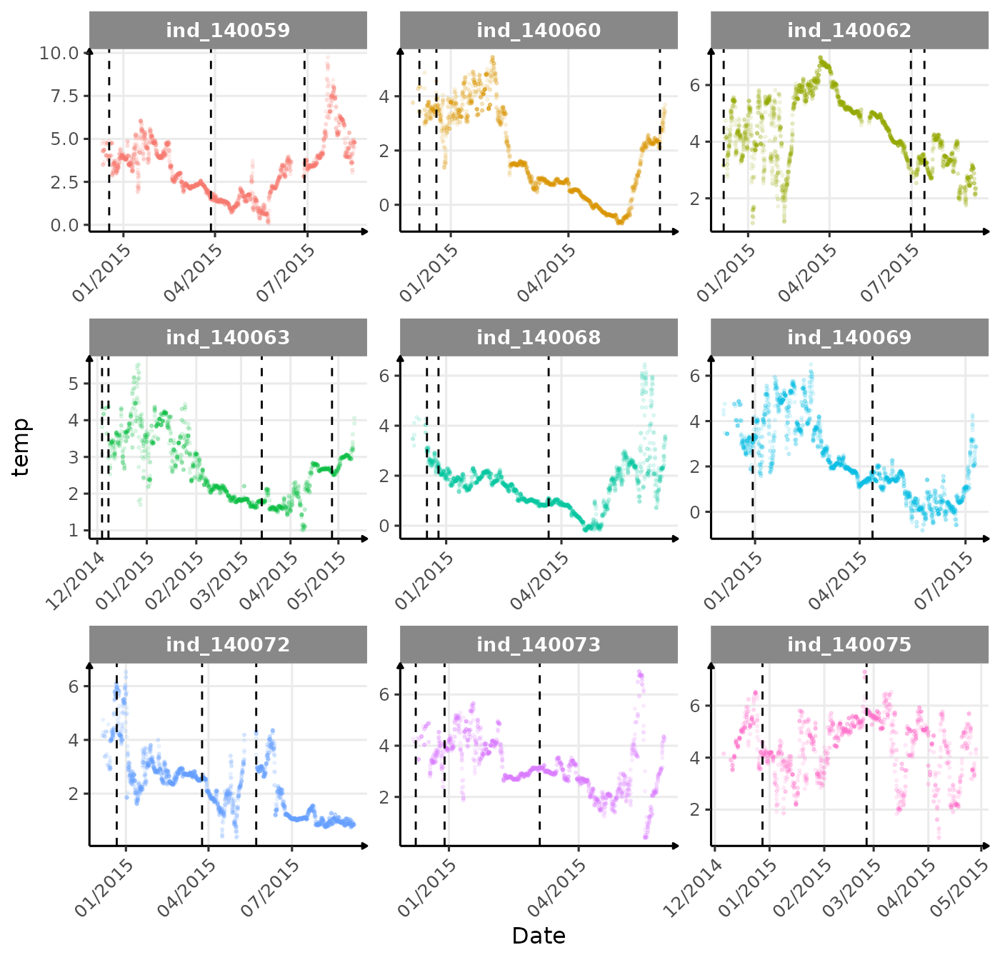
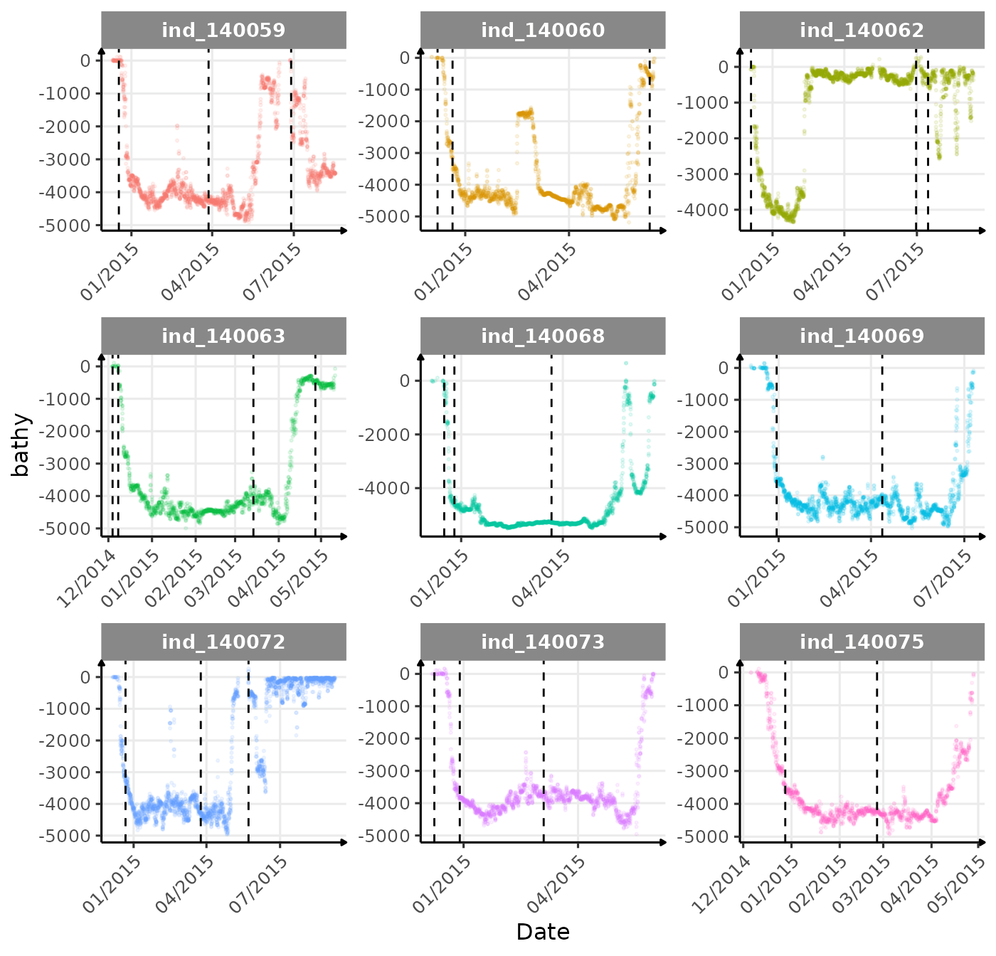
The vertical dashed lines represent changes in buoyancy (see
vignette("buoyancy_detect") for more information)
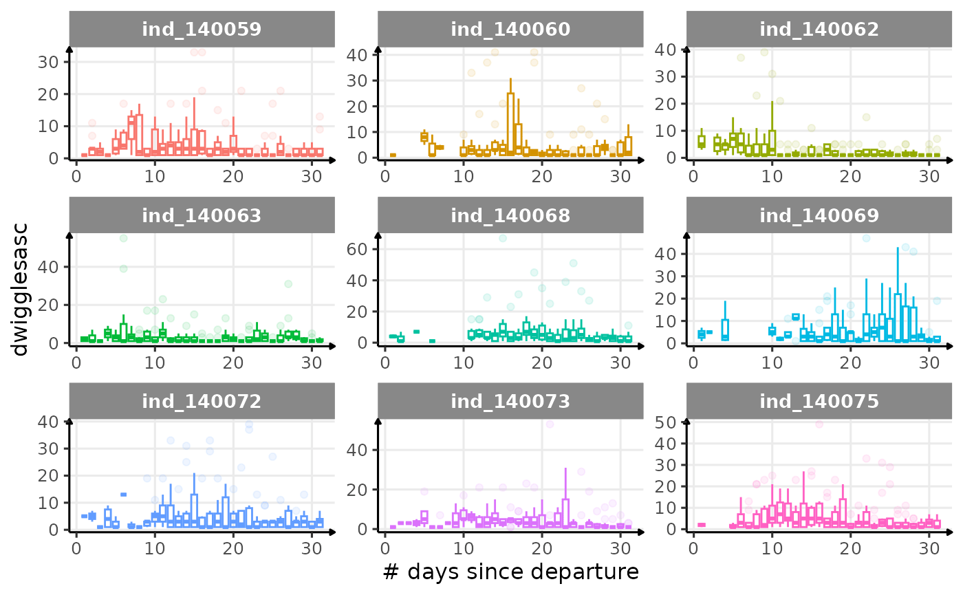
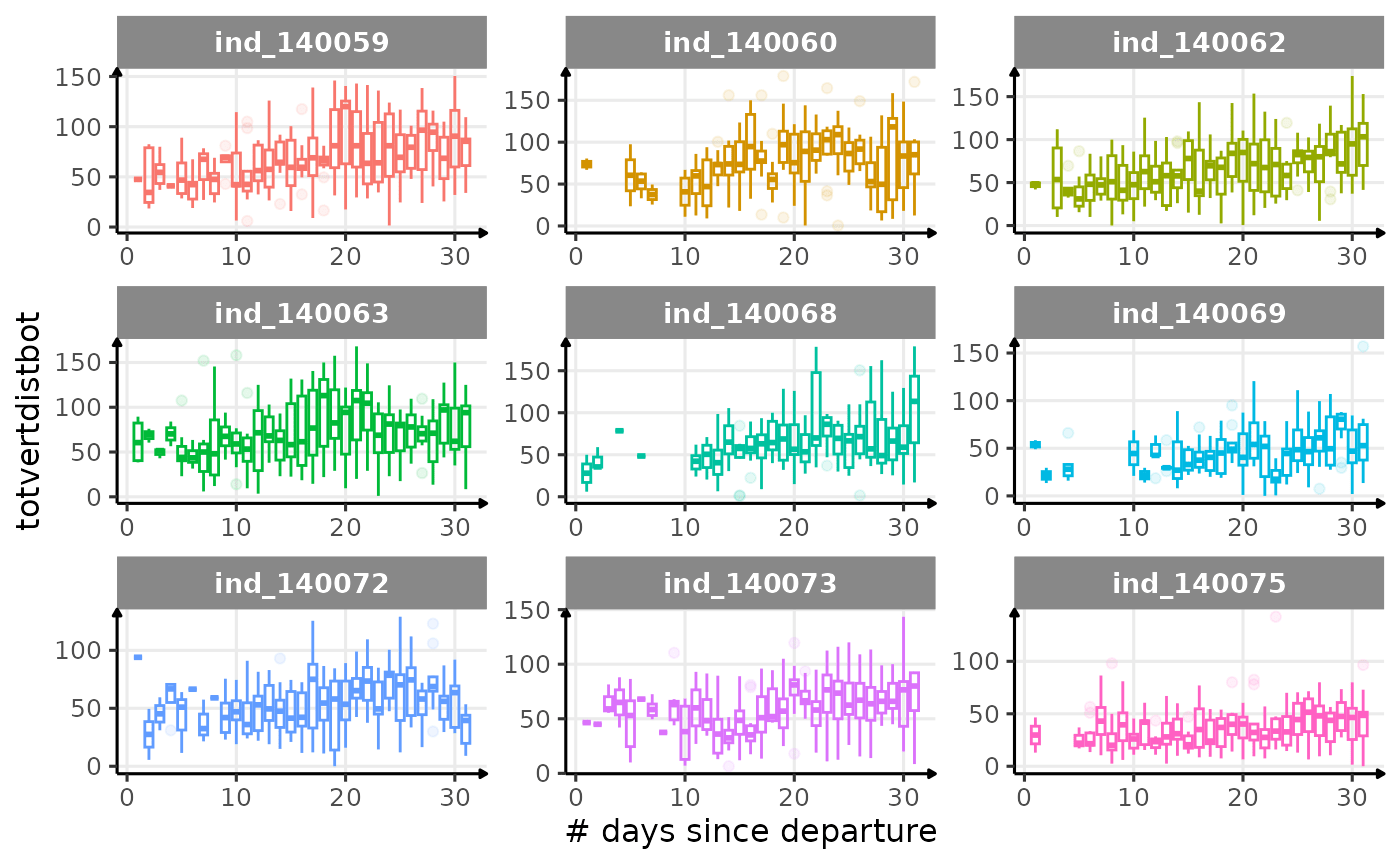
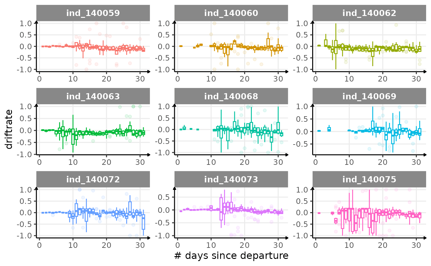
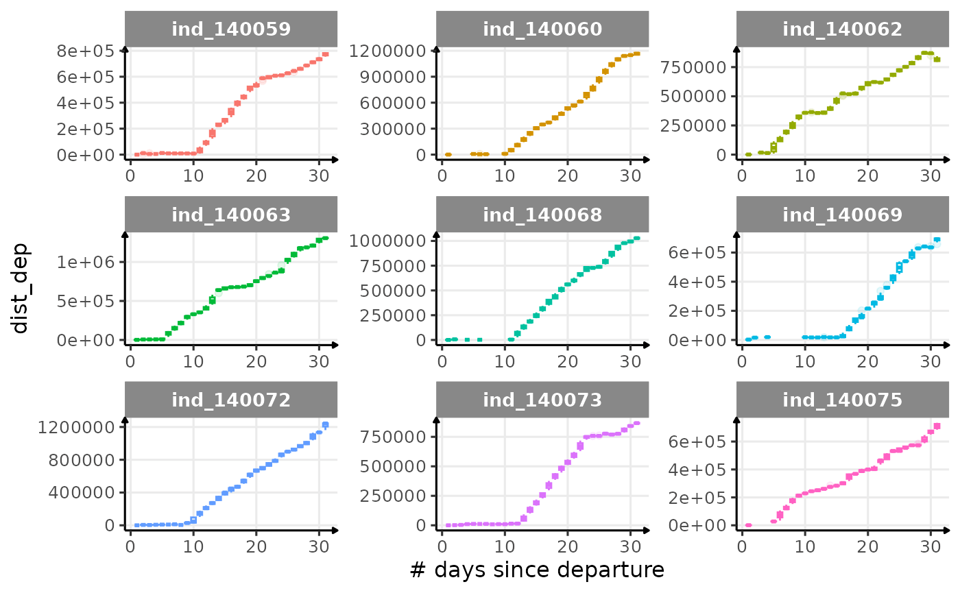
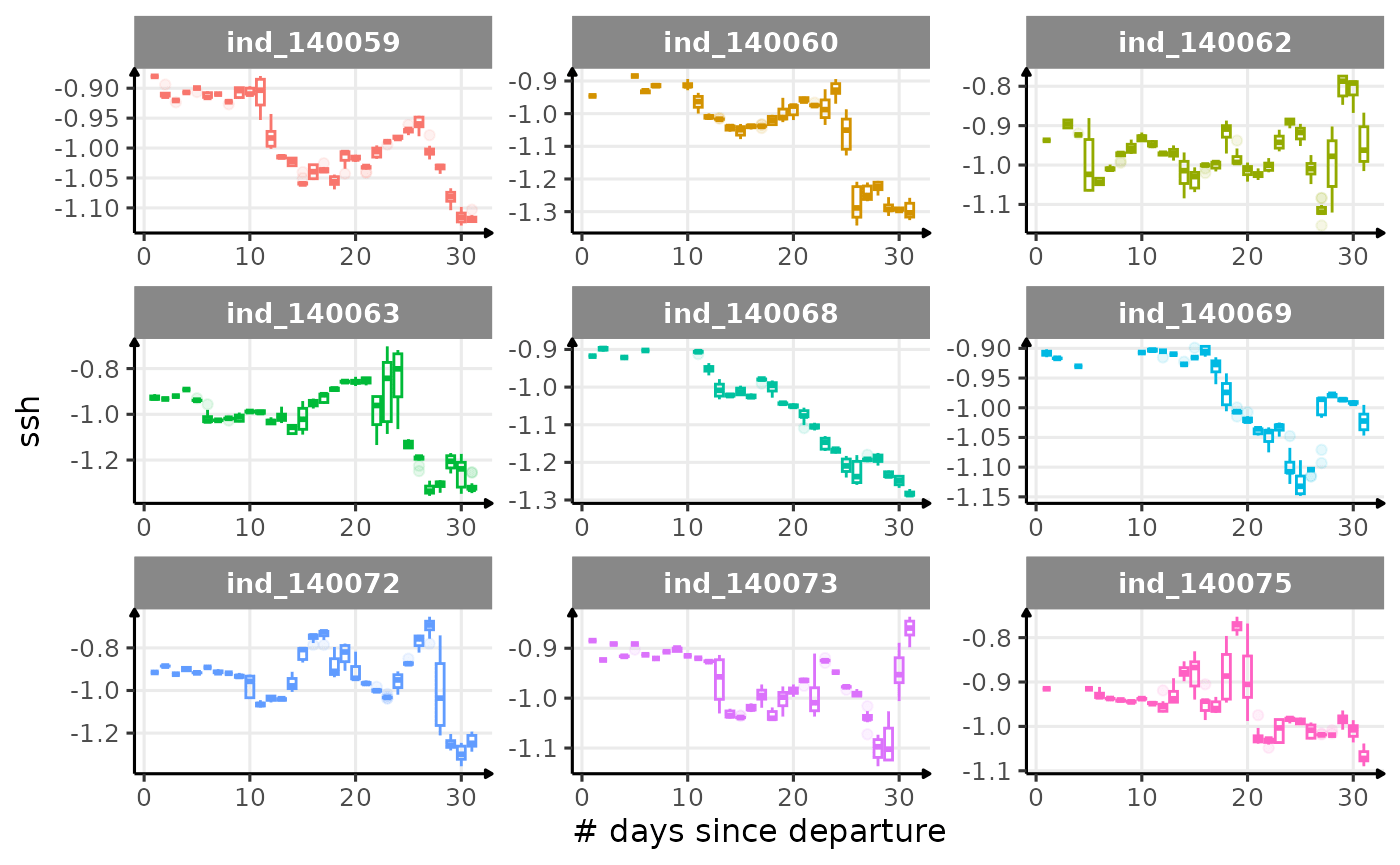
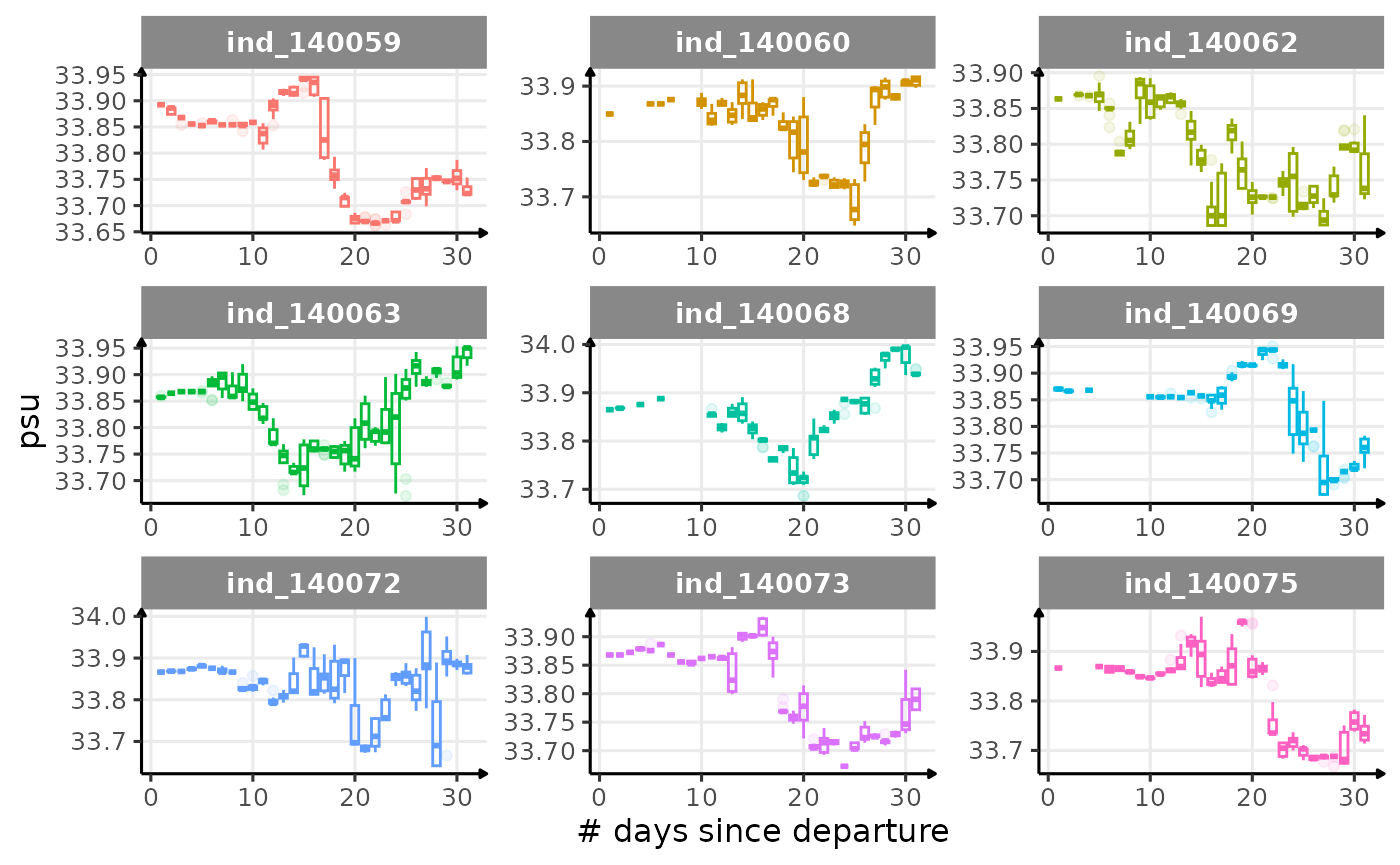
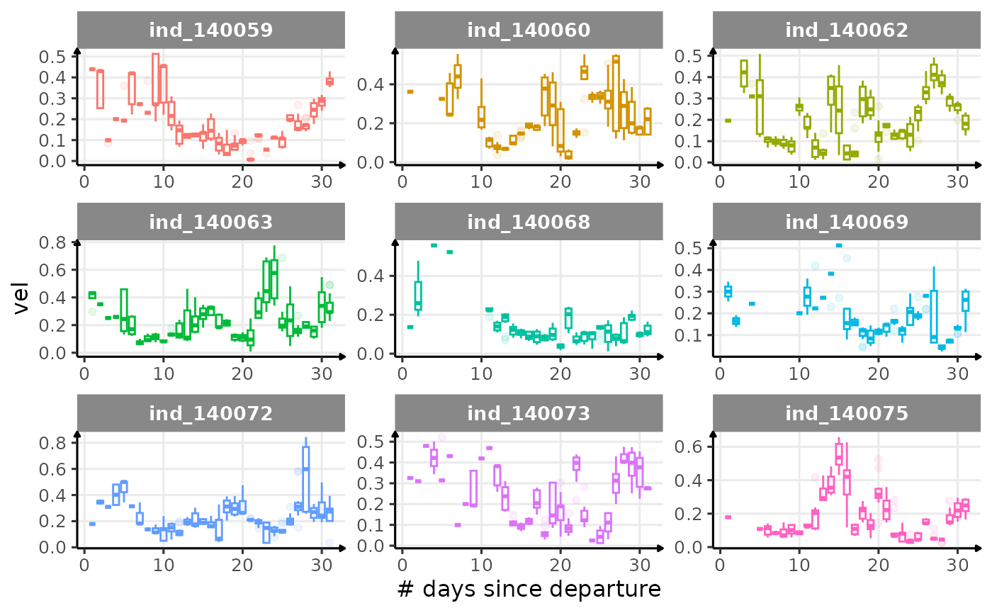
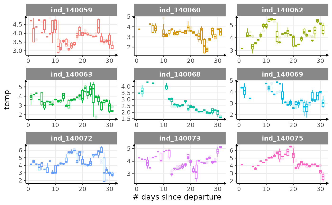
First month at sea
for (i in names_display) {
  # subtitle
  cat("#####", i, "{.unlisted .unnumbered} \n")

  # print plot
  print(
    ggplot(
      data = melt(
        data_2014[
          day_departure < 32,
          .(.id, day_departure, get(i))
        ],
        id.vars = c(".id", "day_departure")
      ),
      aes(
        x = day_departure,
        y = value,
        color = .id,
        group = day_departure
      )
    ) +
      geom_boxplot(
        show.legend = FALSE,
        alpha = 1 / 10,
        size = .5
      ) +
      facet_wrap(. ~ .id, scales = "free") +
      labs(x = "# days since departure", y = i) +
      theme_jjo()
  )
  cat("\n \n")
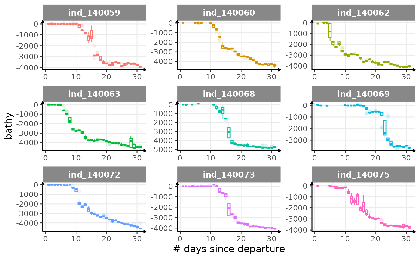
}
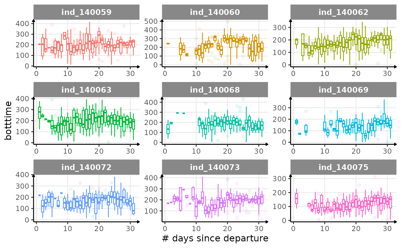
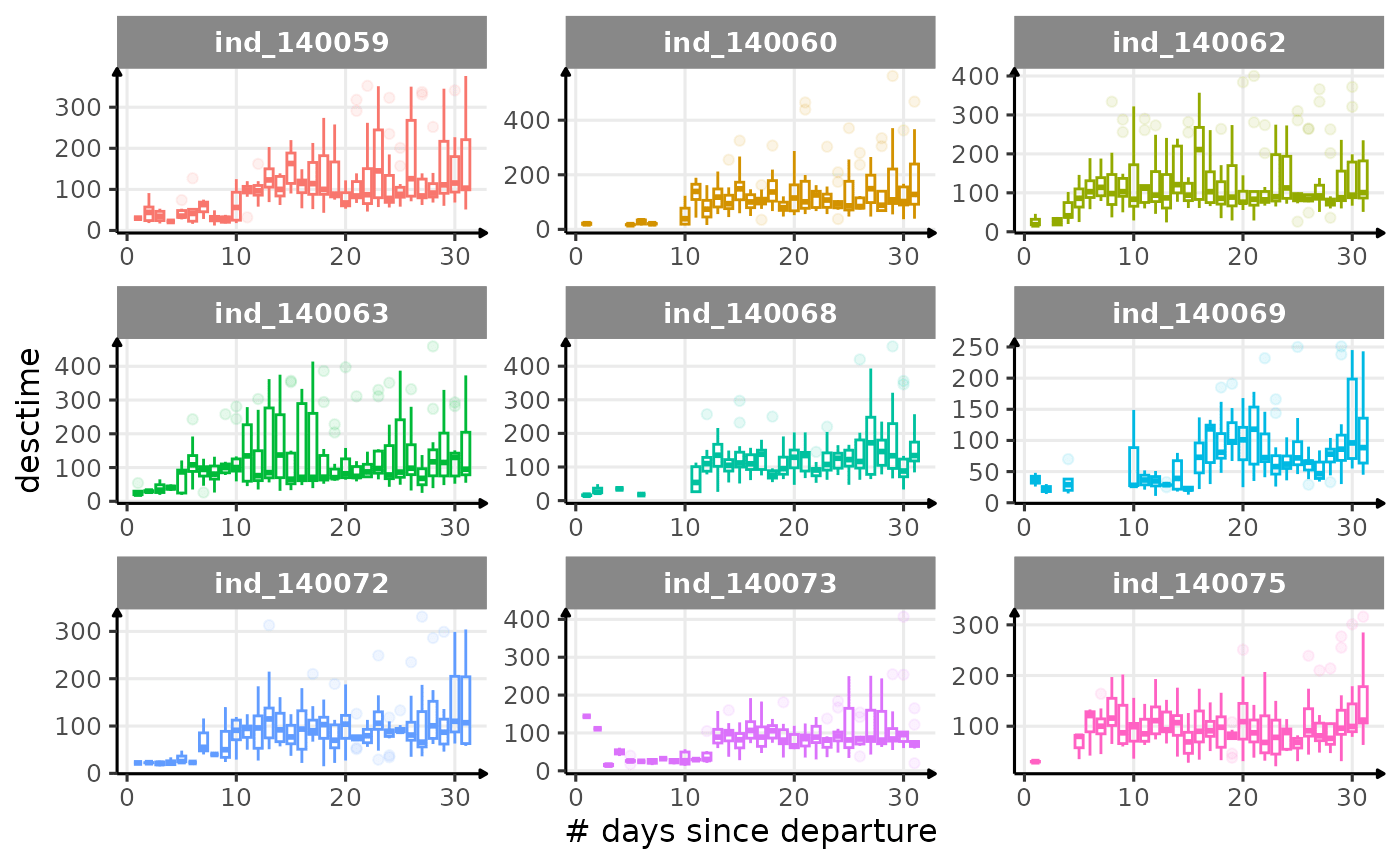
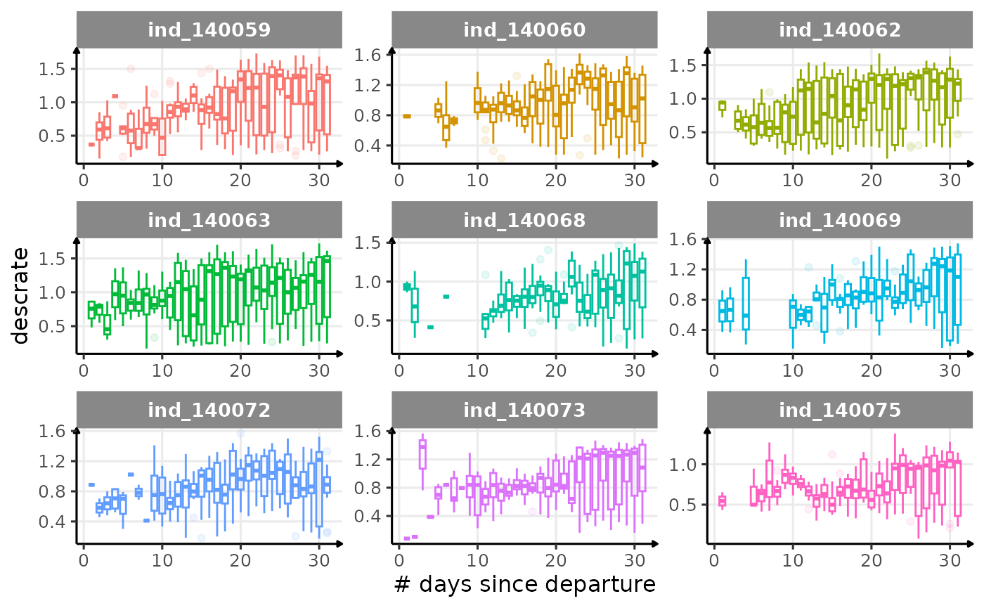
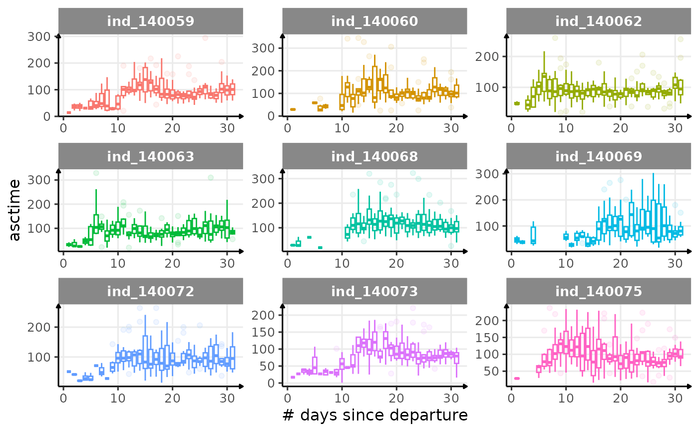
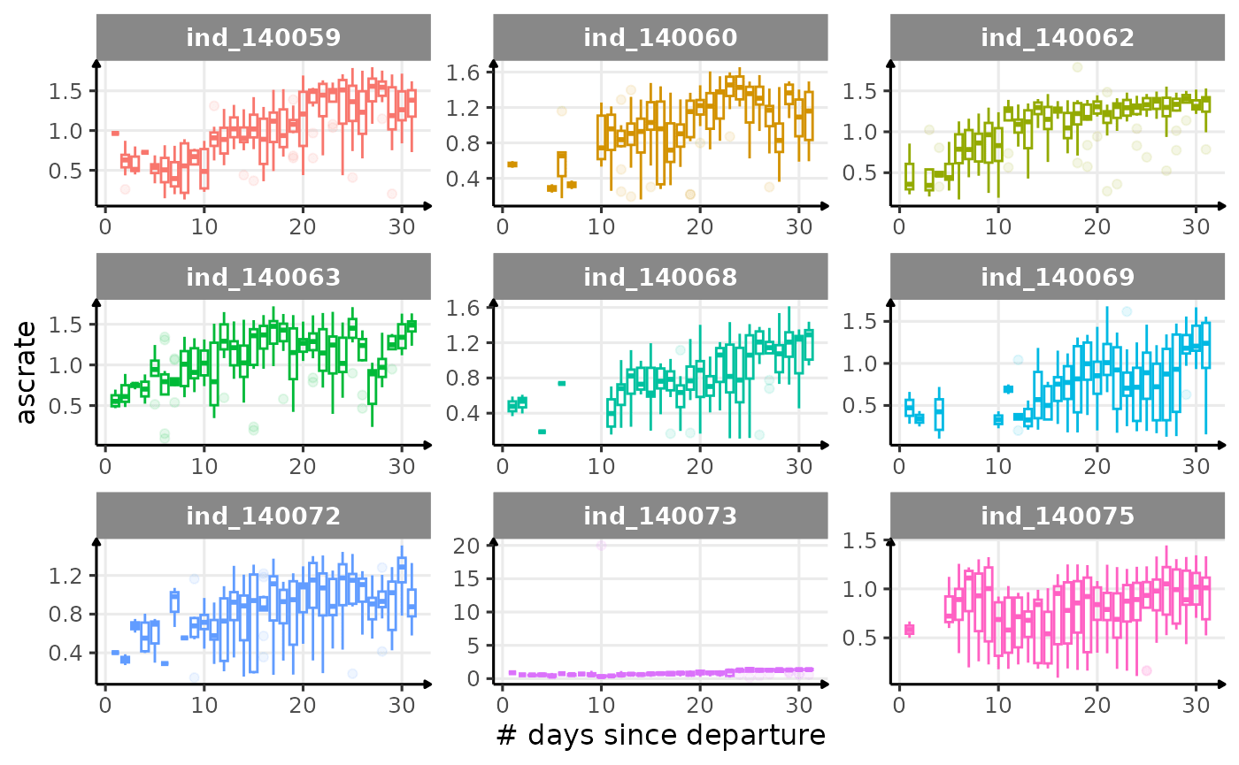
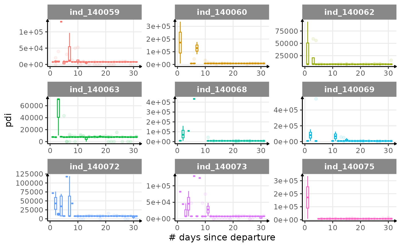
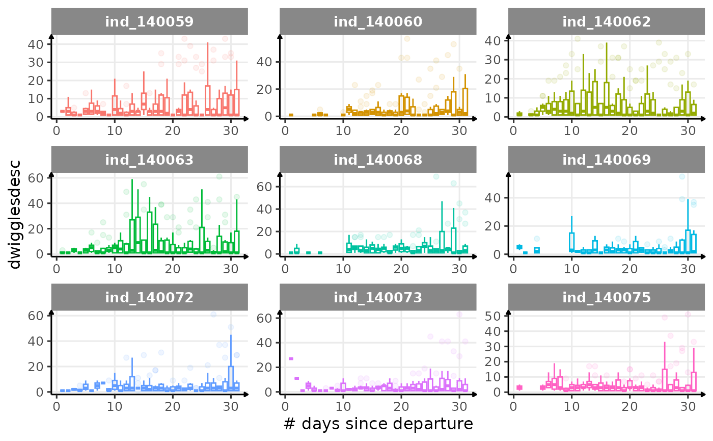
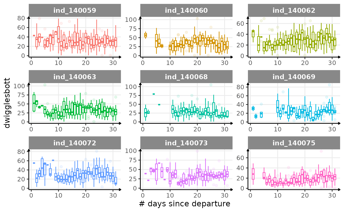
Dive Type
# dataset to plot proportional area plot
dataPlot <- data_2014 %>%
  .[, .(sum_id_days = .N), by = .(.id, day_departure, divetype)] %>%
  .[, prop := sum_id_days / sum(sum_id_days), by = .(.id, day_departure)]

# area plot
ggplot(dataPlot, aes(
  x = as.numeric(day_departure),
  y = prop,
  fill = as.character(divetype)
)) +
  geom_area(alpha = 0.6, size = 1, position = "stack", stat = "identity") +
  facet_wrap(.id ~ ., scales = "free") +
  scale_y_continuous(labels = scales::percent) +
  theme_jjo() +
  theme(legend.position = "bottom") +
  labs(
    x = "# of days since departure",
    y = "Proportion of dives",
    fill = "Dive types"
  )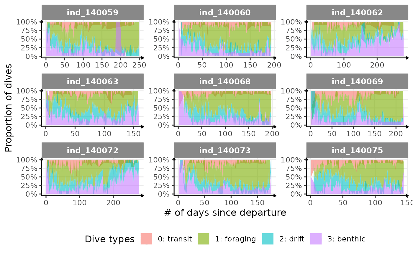
Evolution of dive type proportion
Drift Rate
In the following graphs:
driftrateis calculated using onlydivetype == "2: drift"- whereas all the others variables are calculated all dives considered
- Dives were
driftrate > 0were excluded
# build dataset
dataPlot <- data_2014[
  divetype == "2: drift" &
    driftrate < 0,
  # median drift rate for drift dive
  .(driftrate = median(driftrate, na.rm = T)),
  by = .(.id, day_departure)
] %>%
  # merge to get other parameters including all dives
  .[
    data_2014[driftrate < 0,
      .(
        # median dive duration all dives considered
        dduration = median(dduration, na.rm = T),
        # median max depth all dives considered
        maxdepth = median(maxdepth, na.rm = T),
        # median bottom dives all dives considered
        botttime = median(botttime, na.rm = T)
      ),
      by = .(.id, day_departure)
    ],
    on = c(".id", "day_departure")
  ]
# plot
ggplot(dataPlot, aes(x = botttime, y = driftrate, col = .id)) +
  geom_point(size = .5, alpha = .5) +
  geom_smooth(method = "lm") +
  guides(color = "none") +
  facet_wrap(.id ~ .) +
  scale_x_continuous(limits = c(0, 700)) +
  labs(
    x = "Daily median Bottom time (s)",
    y = "Daily median drift rate (m.s-1)"
  ) +
  theme_jjo()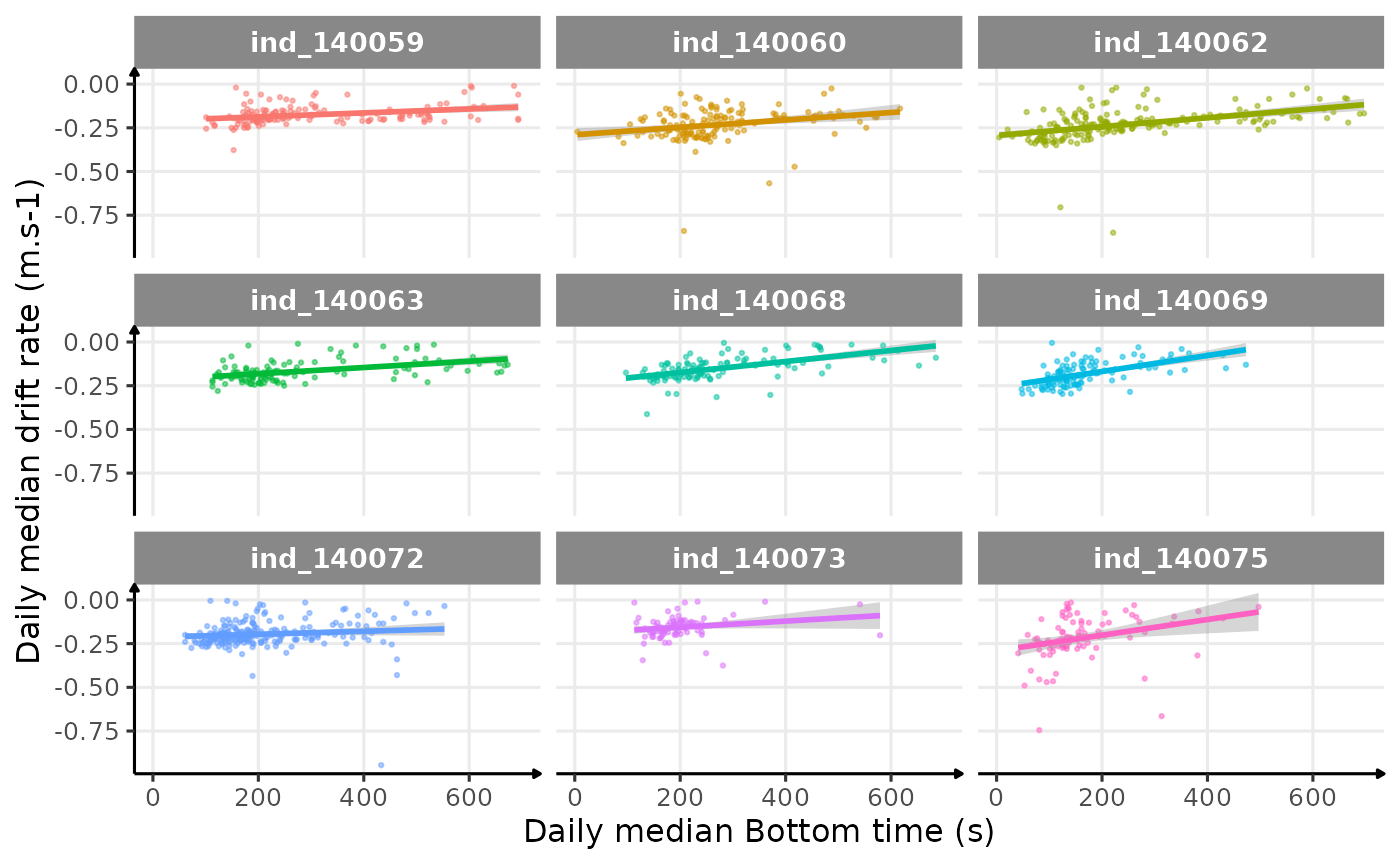
Drift rate vs. Bottom time
# plot
ggplot(dataPlot, aes(x = maxdepth, y = driftrate, col = .id)) +
  geom_point(size = .5, alpha = .5) +
  geom_smooth(method = "lm") +
  guides(color = "none") +
  scale_y_reverse() +
  facet_wrap(.id ~ .) +
  labs(
    x = "Daily median Maximum depth (m)",
    y = "Daily median drift rate (m.s-1)"
  ) +
  theme_jjo()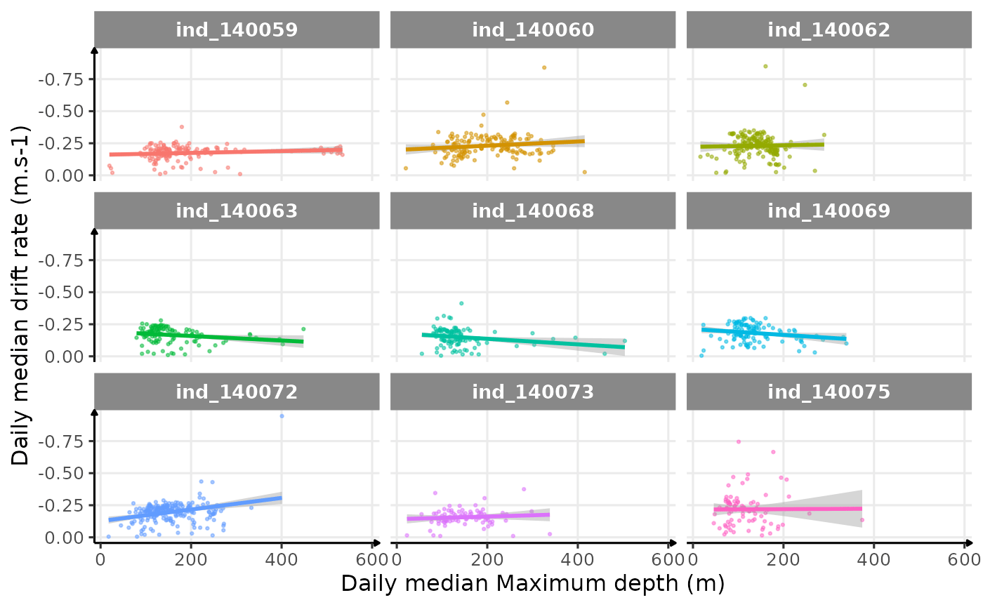
Drift rate vs. Maximum depth
# plot
ggplot(dataPlot, aes(x = dduration, y = driftrate, col = .id)) +
  geom_point(size = .5, alpha = .5) +
  geom_smooth(method = "lm") +
  guides(color = "none") +
  facet_wrap(.id ~ .) +
  labs(
    x = "Daily median Dive duration (s)",
    y = "Daily median drift rate (m.s-1)"
  ) +
  theme_jjo()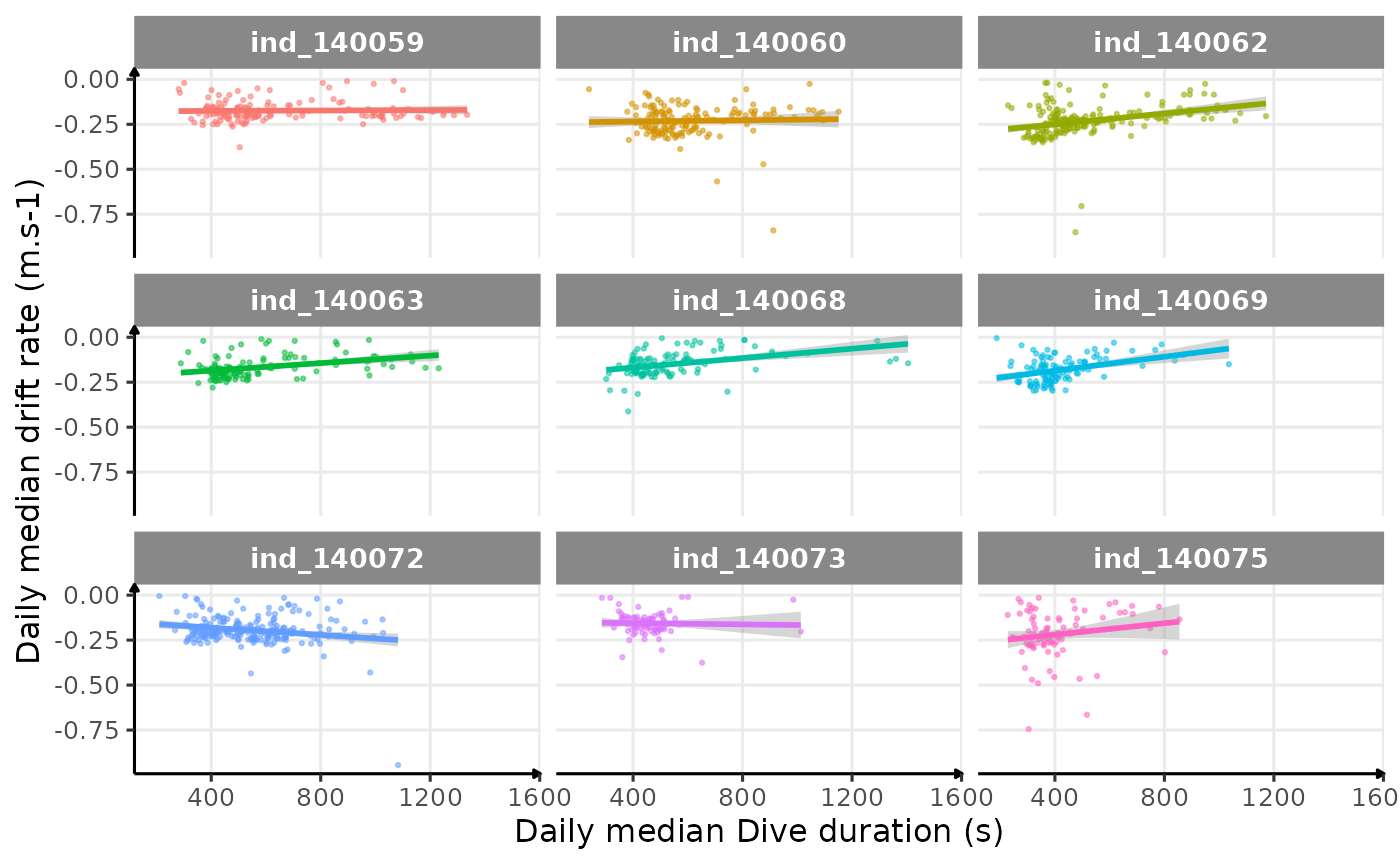
Drift rate vs. Dive duration
Behavioral Aerobic Dive Limit (bADL)
Based on Shero et al. (2018), we decided to look at the bADL as the 95th percentile of dive duration each day, for those with \(n \geq 8\). This threshold was chosen following this figure, please note that this number is particularly low cause only one dive every 2.2 hours was sampled:
ggplot(
  data_2014[, .(nb_dives = .N),
    by = .(.id, day_departure)
  ],
  aes(x = nb_dives, fill = .id)
) +
  geom_histogram(show.legend = FALSE) +
  facet_wrap(. ~ .id) +
  labs(y = "# of days", x = "# of dives per day") +
  theme_jjo() +
  theme(text = element_text(size = 8))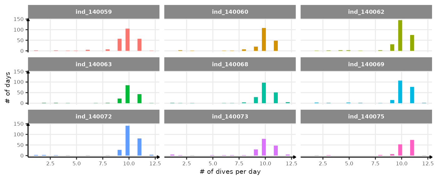
Distribution of the number of dives each day. The threshold used to calculate bADL is fixed at 50 dives per day.
# select day that have at least 50 dives
days_to_keep <- data_2014[,
  .(nb_dives = .N),
  by = .(.id, day_departure)
] %>%
  .[nb_dives >= 8, ]

# keep only those days
data_2014_complete_day <- merge(data_2014,
  days_to_keep,
  by = c(".id", "day_departure")
)

# data plot
dataPlot <- data_2014_complete_day[divetype == "1: foraging",
  .(badl = quantile(dduration, 0.95)),
  by = .(.id, day_departure)
]

# combine two datasets to be able to use a second axis
# https://stackoverflow.com/questions/49185583/two-y-axes-with-different-scales-for-two-datasets-in-ggplot2
dataMegaPlot <- rbind(
  data_2014_complete_day[divetype == "2: drift"] %>%
    .[, .(
      w = .id,
      y = driftrate,
      x = day_departure,
      z = "second_plot"
    )],
  dataPlot[, .(
    w = .id,
    # tricky one
    y = (badl / 1000) - 1,
    x = day_departure,
    z = "first_plot"
  )]
)

# plot
ggplot() +
  geom_point(
    data = dataMegaPlot[z == "second_plot", ],
    aes(x = x, y = y),
    alpha = 1 / 10,
    size = 0.5,
    color = "grey40",
    show.legend = FALSE
  ) +
  geom_path(
    data = dataMegaPlot[z == "first_plot", ],
    aes(x = x, y = y, color = w),
    show.legend = FALSE
  ) +
  scale_y_continuous(
    # Features of the first axis
    name = "Drift rate (m/s)",
    # Add a second axis and specify its features
    sec.axis = sec_axis(~ (. * 1000) + 1000,
      name = "Behavioral Aerobic Dive Limit (s)"
    )
  ) +
  labs(x = "# days since departure") +
  facet_wrap(w ~ .) +
  theme_jjo()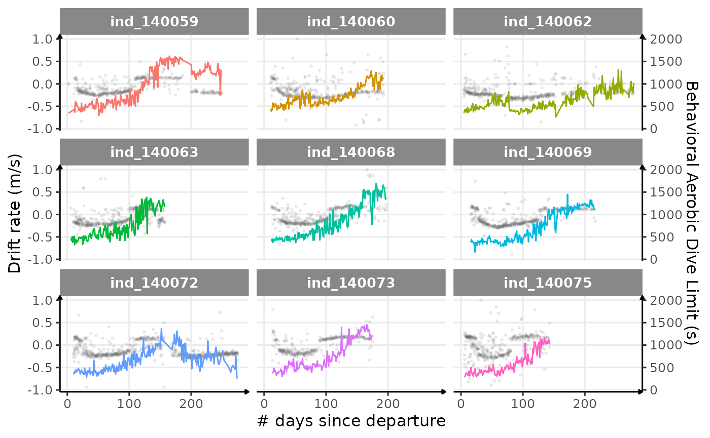
Behavioral ADL vs. drift rate along animals’ trip (Am I the only one seeing some kind of relationship?)
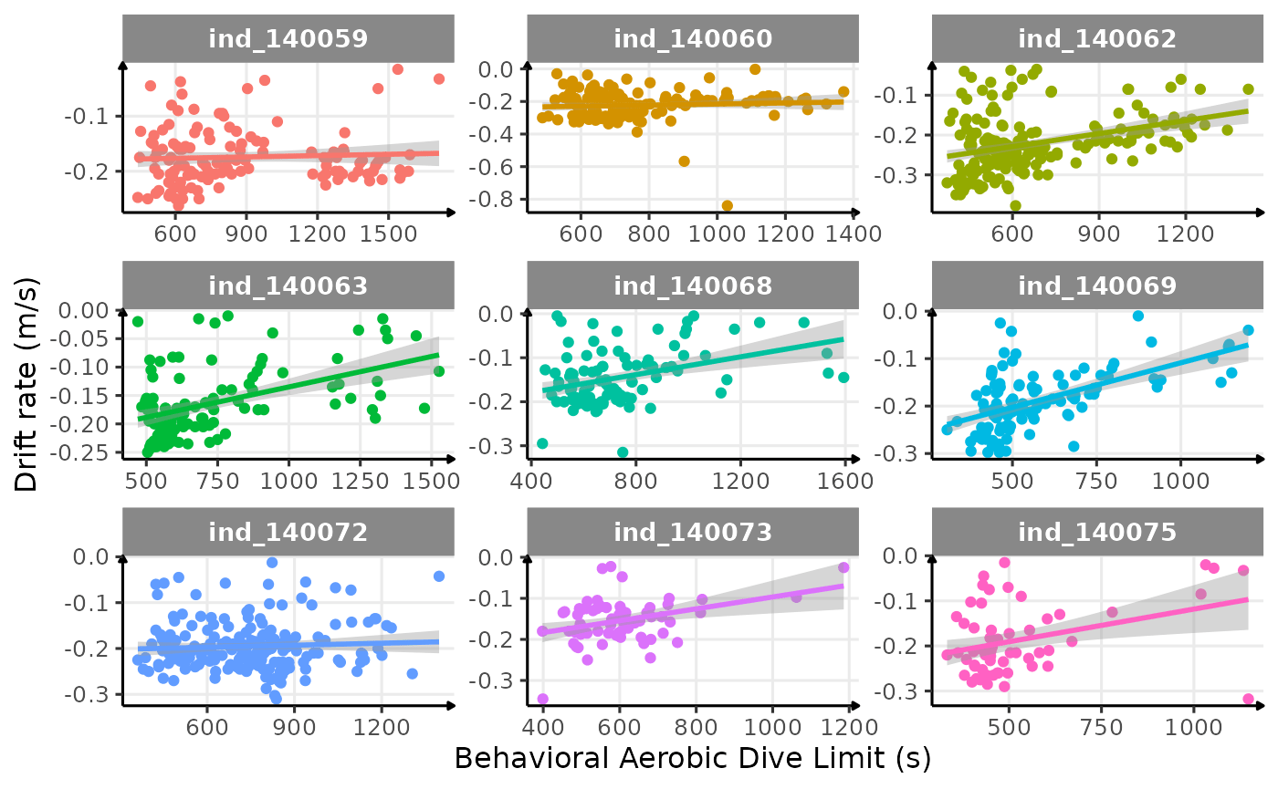
Looking at this graph, I want to believe that there is some kind of relationship between the bADL as defined by Shero et al. (2018) and the drift rate (and so buyoancy).
# get badl
dataplot_1 <- data_2014_complete_day[,
  .(badl = quantile(dduration, 0.95)),
  by = .(.id, day_departure)
]
# get driftrate
dataplot_2 <- data_2014_complete_day[divetype == "2: drift",
  .(driftrate = median(driftrate)),
  by = .(.id, day_departure)
]

# merge
dataPlot <- merge(dataplot_1,
  dataplot_2,
  by = c(".id", "day_departure"),
  all = TRUE
)

# plot
ggplot(
  data = dataPlot[driftrate < 0, ],
  aes(x = badl, y = driftrate, col = .id)
) +
  geom_point(show.legend = FALSE) +
  geom_smooth(method = "lm", show.legend = FALSE) +
  facet_wrap(.id ~ ., scales = "free") +
  labs(
    x = "Behavioral Aerobic Dive Limit (s)",
    y = "Drift rate (m/s)"
  ) +
  theme_jjo()